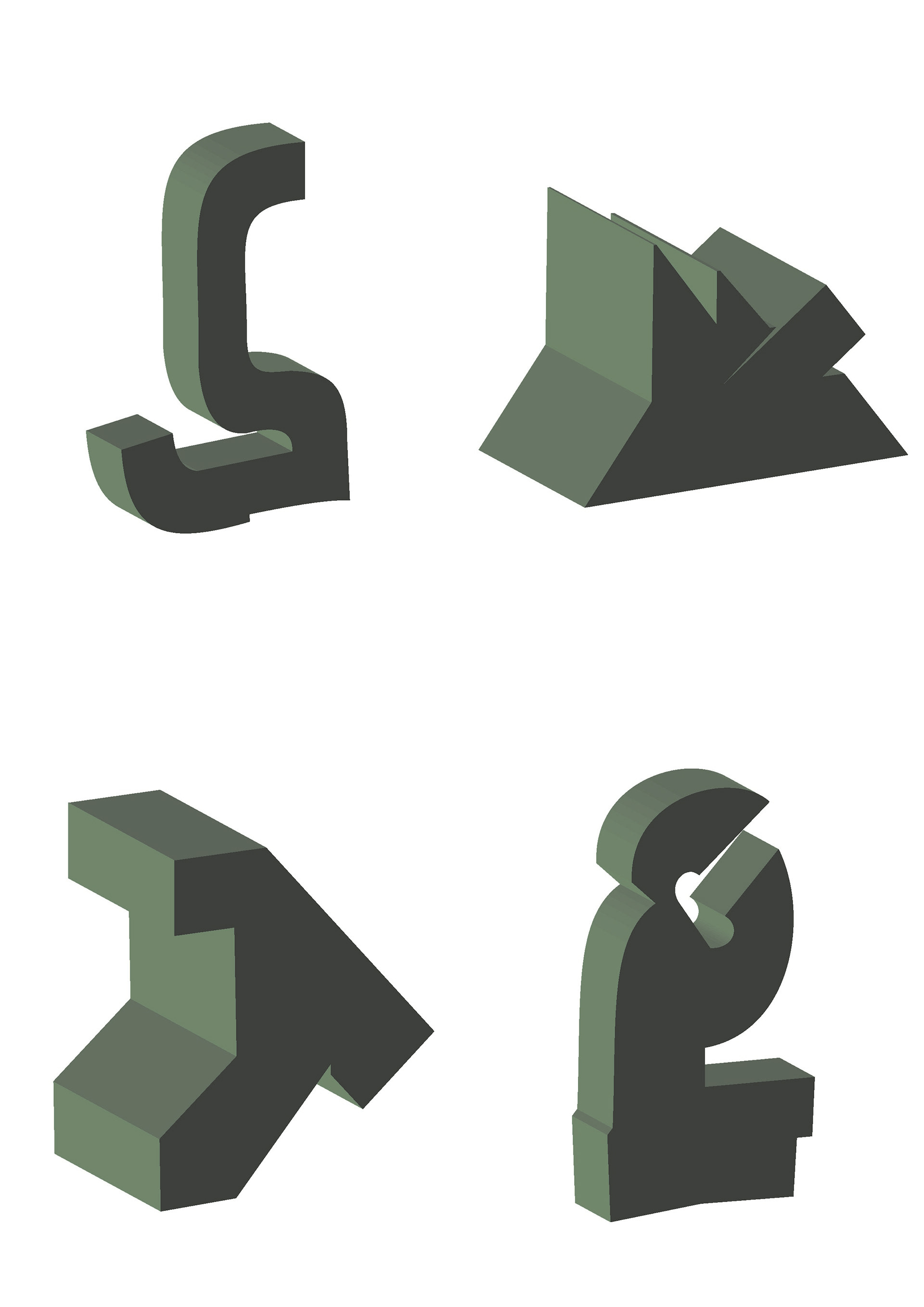
Exploring 3D shape from earlier character collaging (development work)
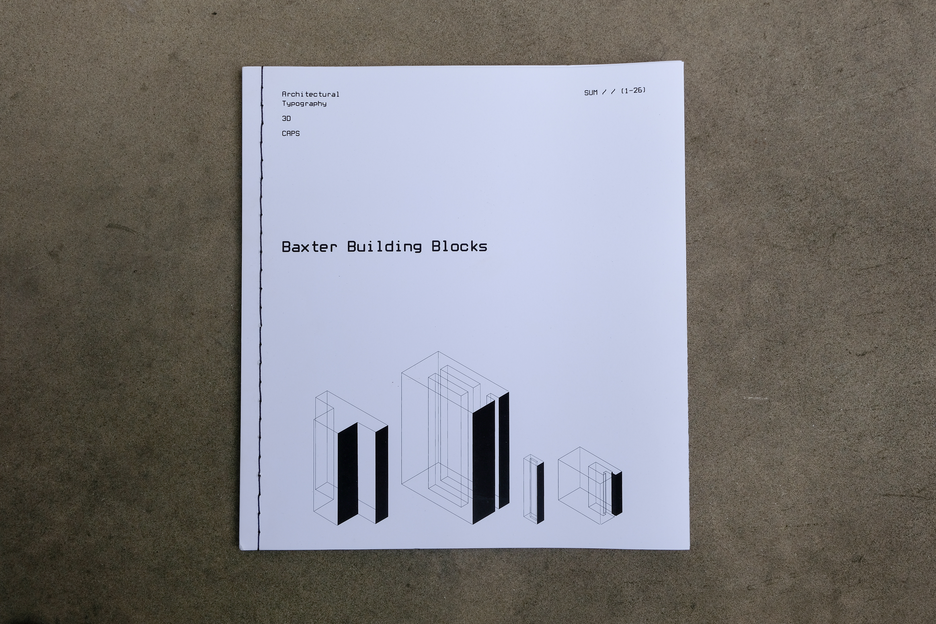
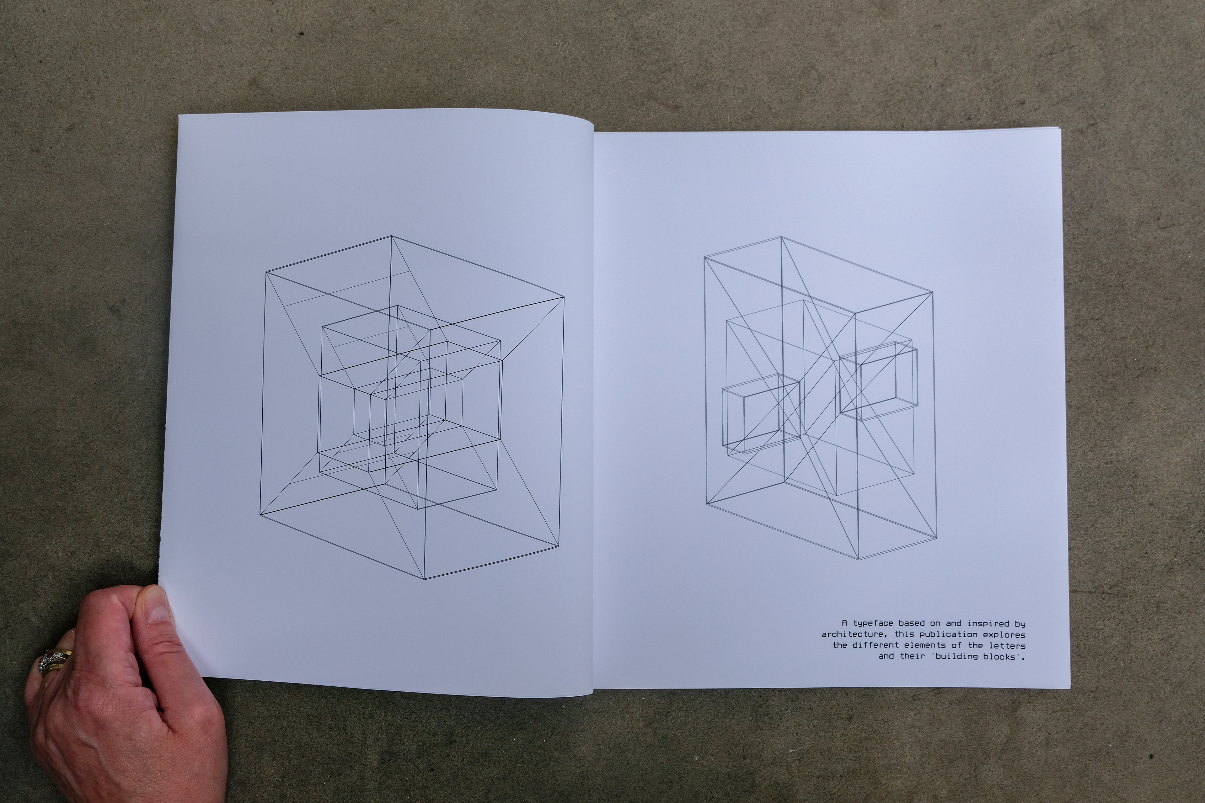
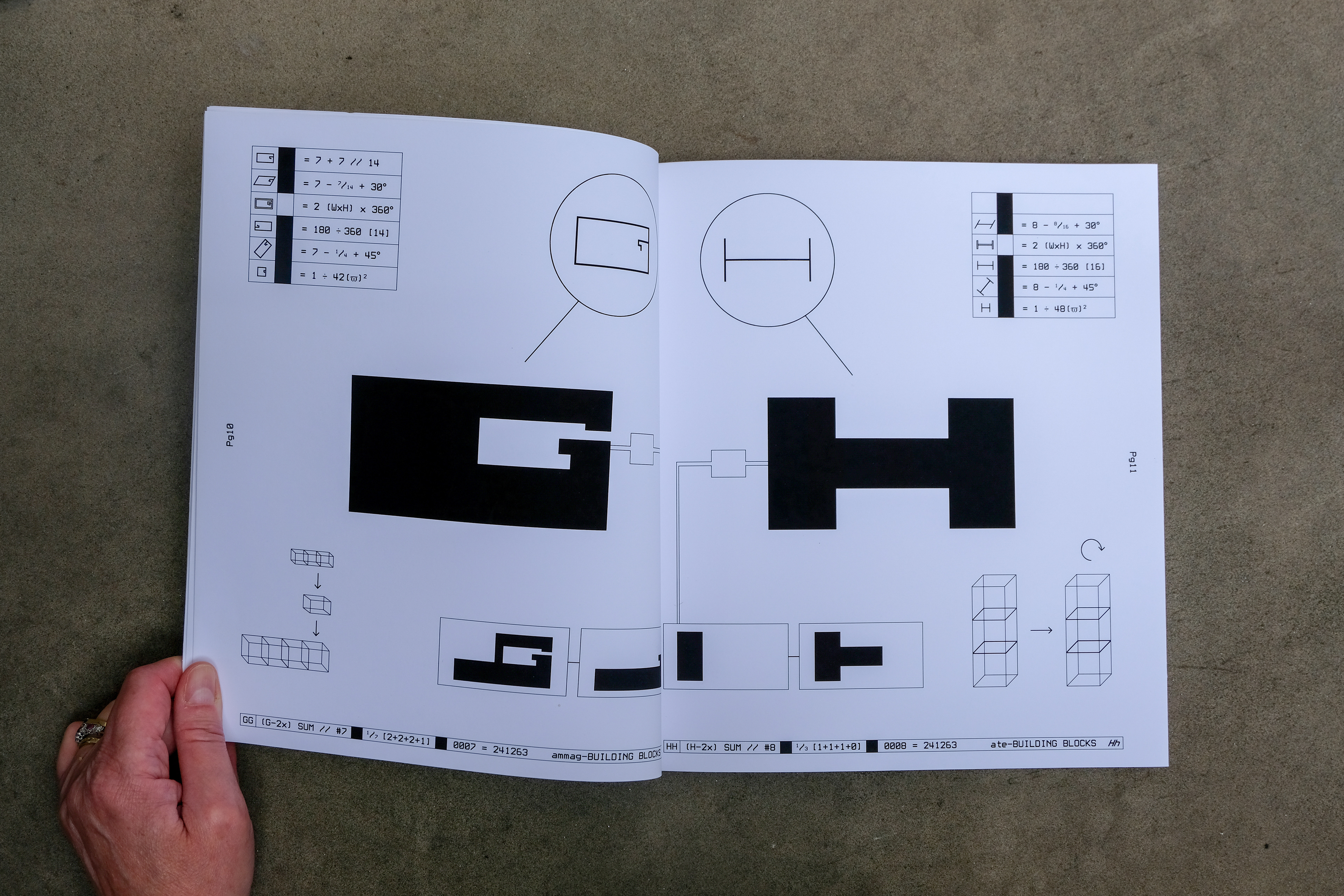
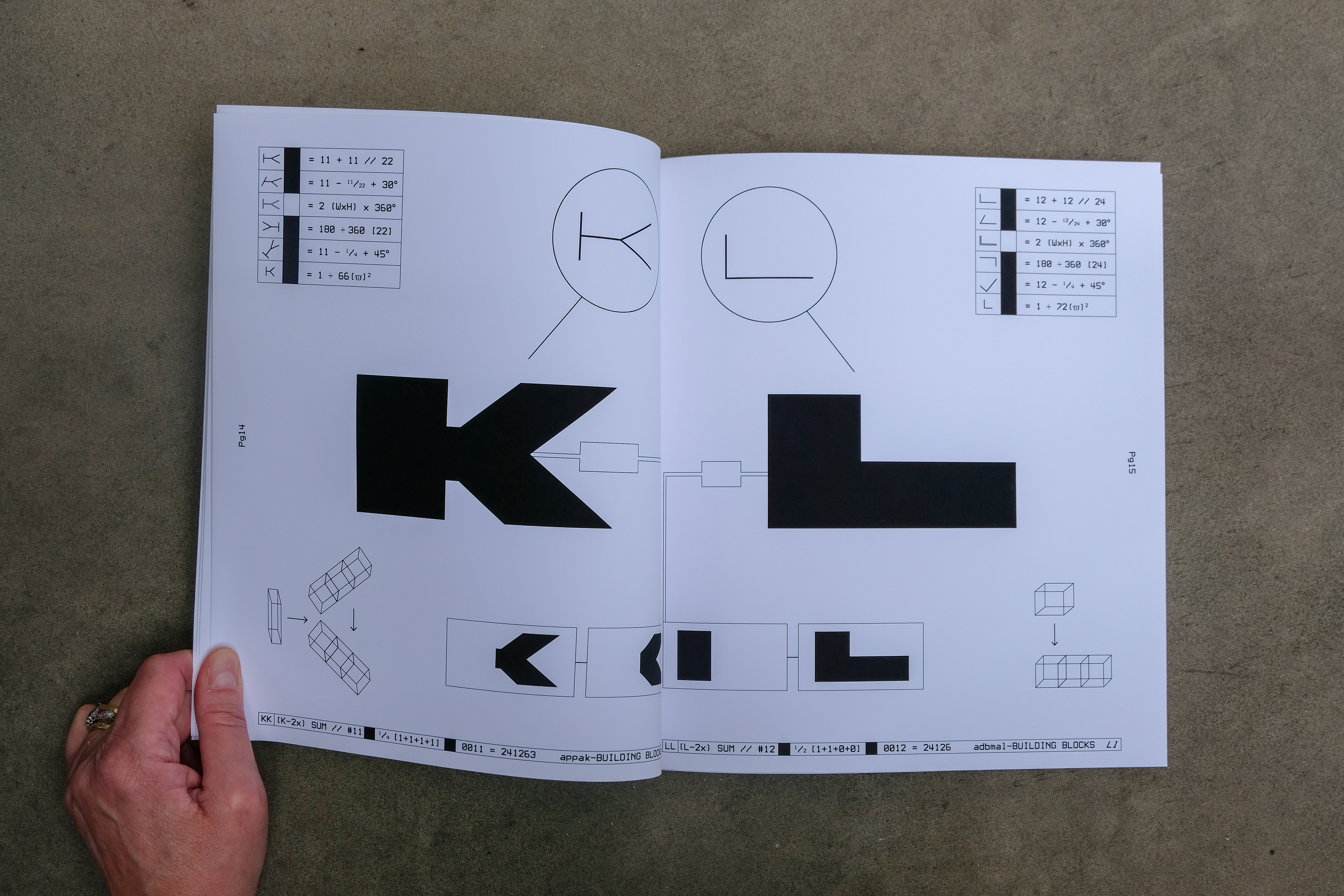
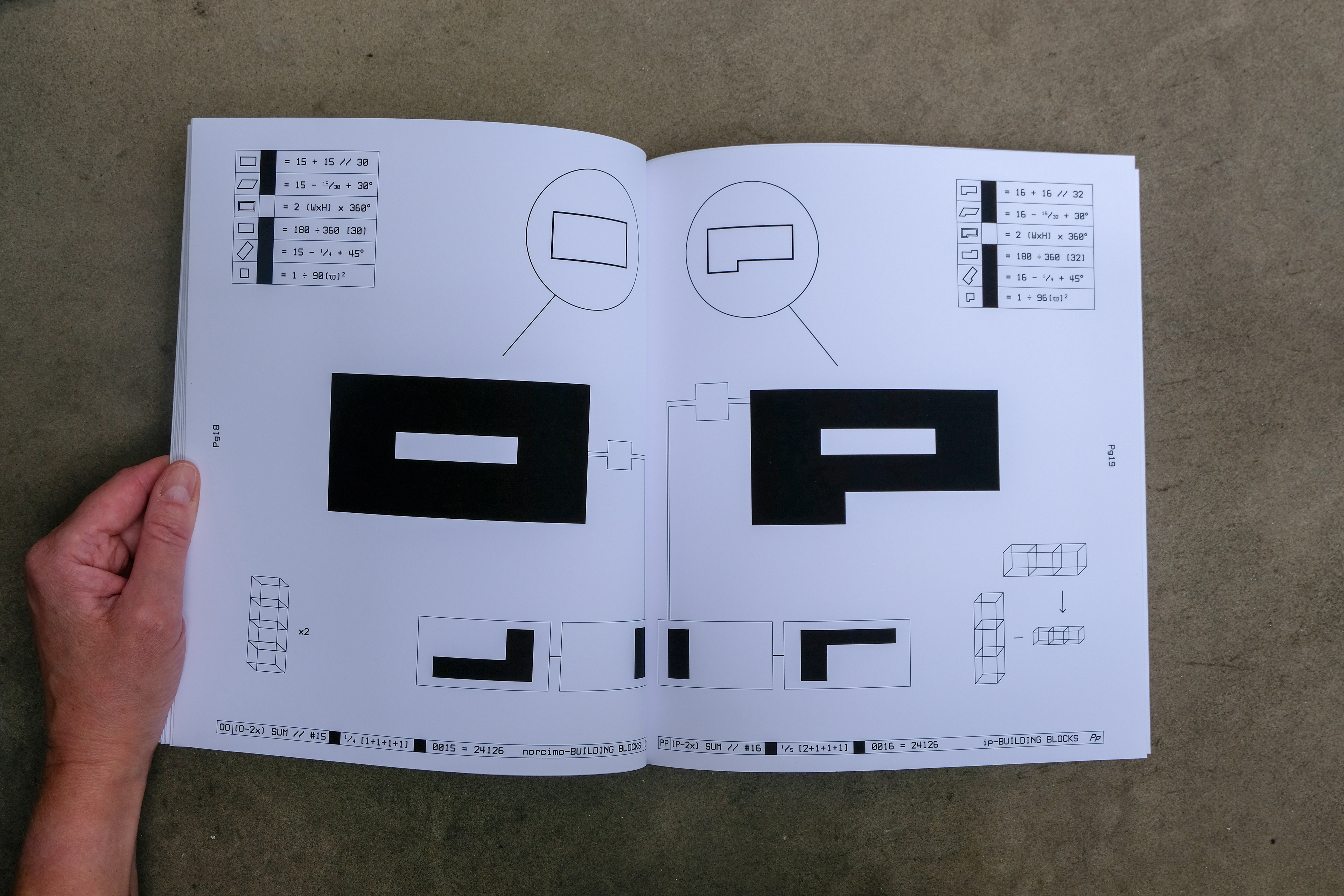
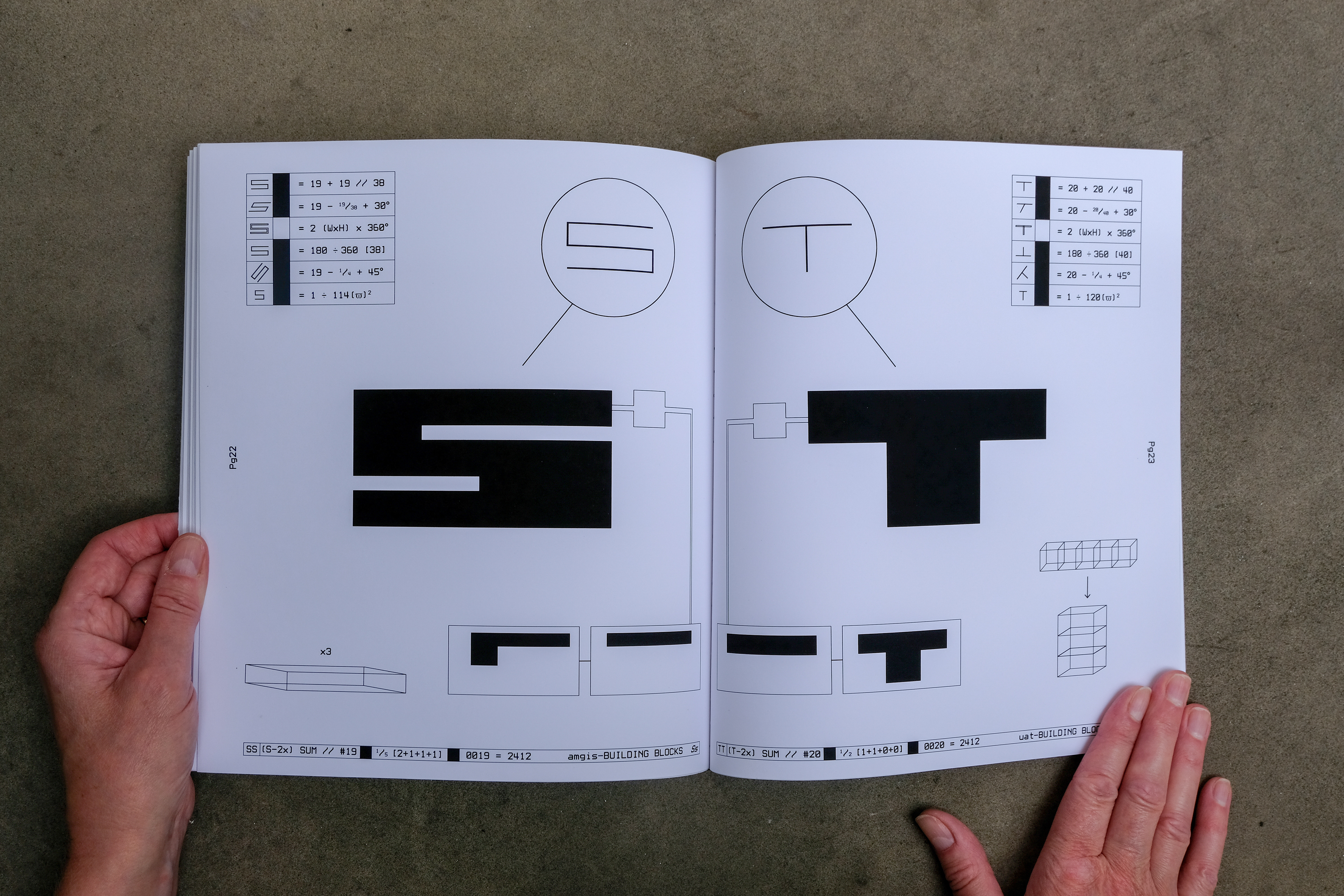
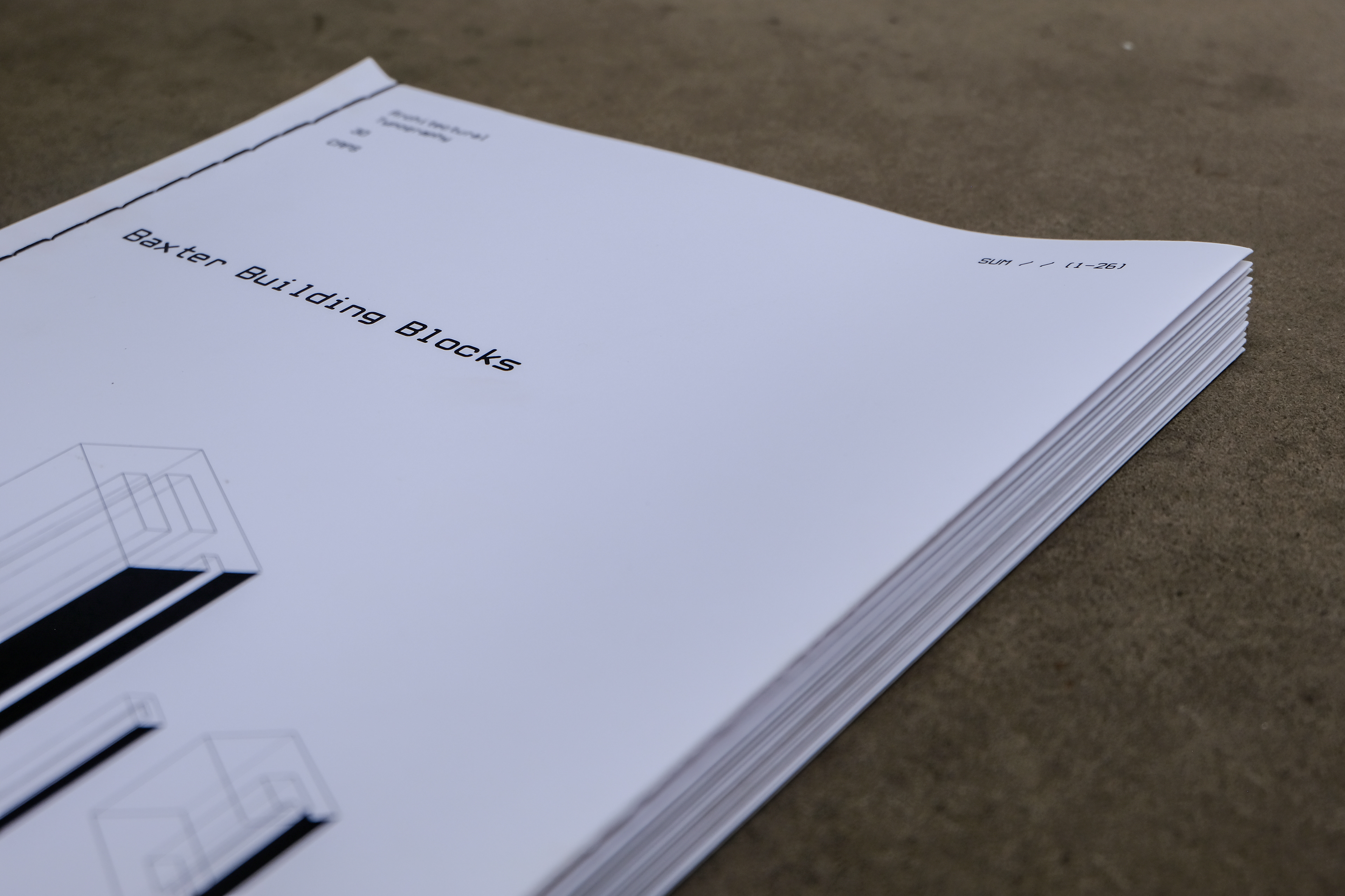
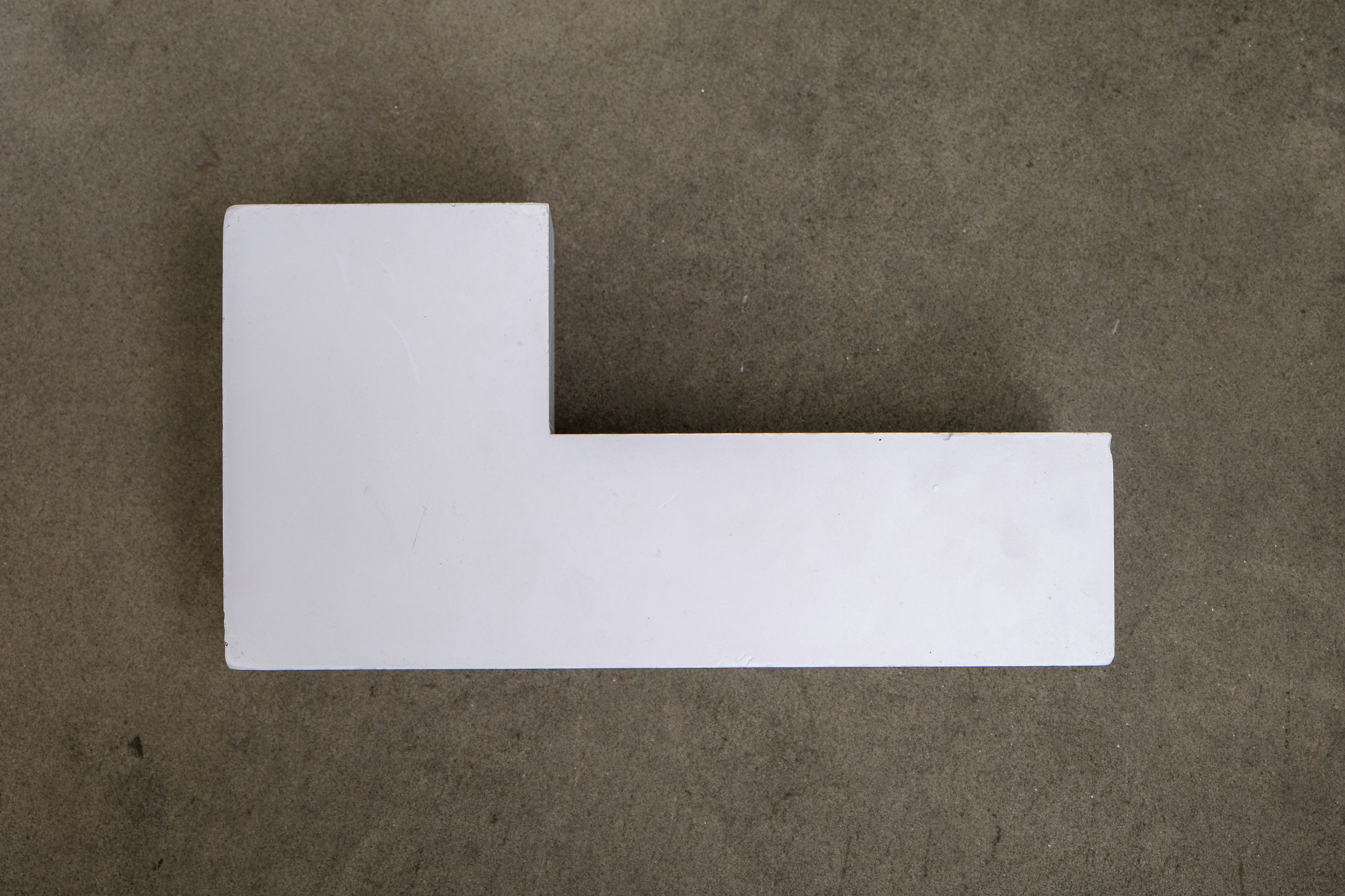
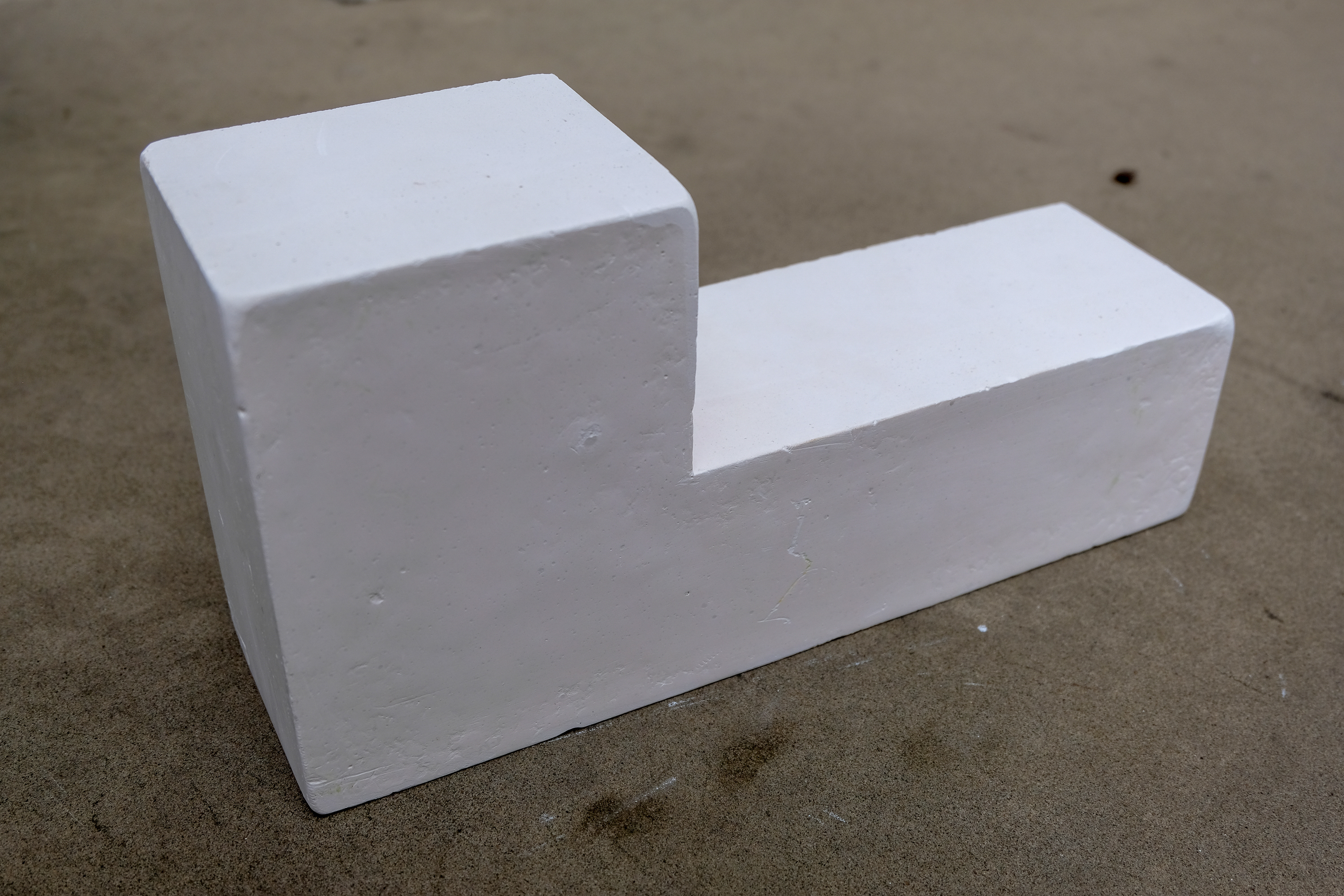
Inspired by the modular and block-like style of Brutalist architecture, I designed the typeface 'Baxter Building Blocks'. The typeface is displayed in a publication with an accompanying poster series, which explores how each letter is formed and their different 'views' or 'states'. Using mathematical equations and showing the construction of each letterform, I wanted to express this sense of built letters; playing into the idea of architectural construction. To explore the ideas through making, I cast some letters in concrete and Plaster of Paris to insinuate the sense of raw building materials and construction. The book was printed and bound by hand on 140gsm matte paper, using a running stitch bind and French fold.